#DANDAD17: inspirations from DAY 1
Posted by Raluca Turcanasu on / 0 Comments
After my first 2 days of volunteering before the festival it wad finally time for excitement: inspiring speakers and seminars time! I would soon discover the busy schedule of the day, hopping from stage to stage to see & hear the speeches, just like at a music festival.
-
How do you like them EGGS – at Mother London
I started my day early in the morning @Mother London, which hosted one of the D&AD Fringe events: a one-to-one elevator pitch for fresh ideas. They invited idea-havers over a breakfast eggstravaganza to come and incubate their creative thoughts with industry experts and mother hens.
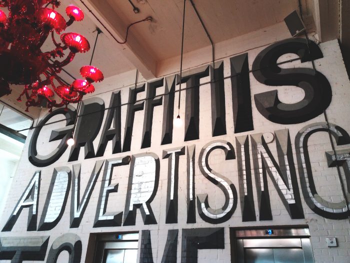
It was super nice to be invited there over breakfast, network with other young creatives who shared their ideas with me (so I got to give them some improvement suggestions) and get to chat with a senior creative from Mother.
I talked about my desire to nurture creative studios and brands – starting with 8istudio.ro and Skeptic Dog Animation and pursuing this further with developers, designers and illustrators and artists of all kinds. I appreciated his neutral input – that selling those creatives’ work is a full time job and if I want to do strategic planning I should just focus on that. And for the moment focus is indeed what I need, while I still believe in my idea for some future times.
-
The Opening
After the talk I headed down to The Old Truman Brewery – the main event space. The festival debuted with D&AD Presidents’ Welcome speech, that is Bruce Duckworth and Turner Duckworth.
The most important piece of advice: „Be like sponges!”. I did it during the festival and it truly showed – at the end of each day I really felt empowered but also brain exhausted (in a good way of course).
Read here D&AD’s president’s, Bruce Duckworth, manifesto
The first day of the festival focused a lot on how design can positively & wholistically impact society. On one side there is the untapped desire of designers & creators of all sorts to put their skills to good (kind) use and on the other side there are the big brands’ managers who become more and more aware of their (brand’s) power and make room for such opportunities.
Bruce Duckworth was saying that „doing good and doing what we’re good at has been torn apart”, but the good news is that we have this collective creative brilliance that begins to flourish in a lot of fields.
This later inspired me to doodle this on a trainride:
#trainride #doodling inspiring #quotes from #dandad17 @bruceduckworth1 pic.twitter.com/LAnARM9PcU
— Raluca Turcanasu (@ralucaralucis) May 5, 2017
So, after the welcome speech I remained seated at the Adobe Stage to hear James Turner talk about the collision of creativity and activism. Social activism empowered by design is a topic very close to my core and my values as seen in my work and personal projects.
-
When creativity and activism collide – James Turner

James Turner founded Glimpse , a group of creative people who want to use their skills for good. Their deeply routed values should be each & everyone’s:
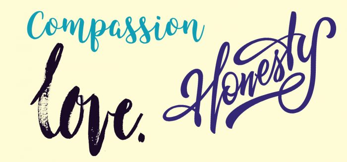
„We should encourage the global population to express less anger and more hope and positivity with ripple effects”. Or, like the rastaman teachings: Love & Unity.
We should never ever be pointing fingers at no one, no matter his situation. We need to remember that
the struggle is in the mind and we are all Christ and Hitler after all.
After those empowering & positive thoughts, James went on to tell us about how Glimpse posivitely impacted Londonese public transportation users through the CATS campaign – replacing tube ads with cats, because yes we all love them and why not take them out of the newsfeeds and into our daily lives?
See more about the campaign here.
Because people have the power to replace advertising that just tell us to shop and consume with campaigns that are fun, artworks you’d take a selfie with, visuals that truly decorate a city.
„Acknowledge the story we tell ourselves about where the world is going.” And where we are going for that matter.
- what 3 words
What 3 words is a humanized location reference system based on a global grid of 57 trillion 3mx3m squares. Each square has been pre-assigned a fixed and unique 3 word address, which brings about a much better UX than traditional address systems. The latter have been failing their function in both large and secluded cities around the world – be it that buildings have been demolished or constructed making a mess of traditional numeric addresses or countries with virtually no infrastructure.
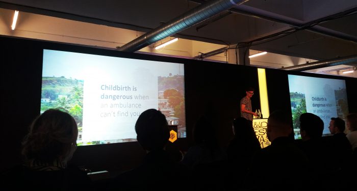
In 2016 the project won a white pencil – see here the entry.
This year a DM graphic design was awarded a Graphite Pencil.
Check here 5 Things we learnt about addressing the world: https://inside.dandad.org/members/videos/5-things-learnt-addressing-world/
Roll your sleeves up and make it happen!
Stay posted for next inspirations from @DANDAD17!


