BRANDING WORK: Patru Maini – the buy social construction company
Posted by Raluca Turcanasu on / 0 Comments
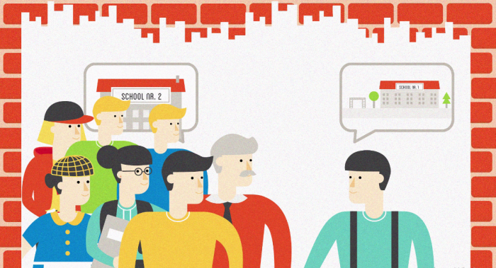
Patru Maini (Four Hands) is a construction producer with a social mission: improving life conditions for children, by renovating public facilities, such as schools, kindergardens or children hospitals.
During my time at Rusu+Bortun I have actively contributed to developing their brand. The agency had recently audited the company (previously named Baumix) and rebranded them (that is designed the corporate logo and product range logos). Yet, there were many brand assets that needed to be aligned with the new branding.
Those are some variations of the corporate logo:
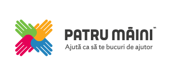

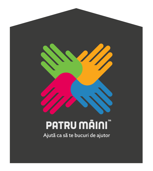
Brand tagline: Help in order to enjoy help
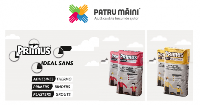
These are the range logos:
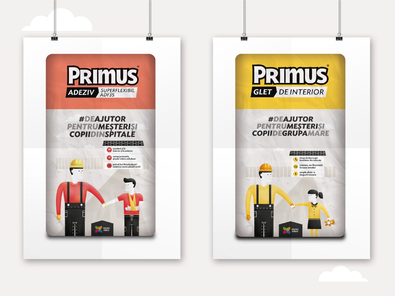
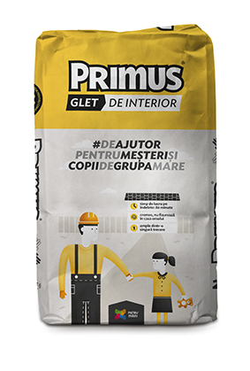
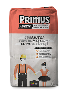
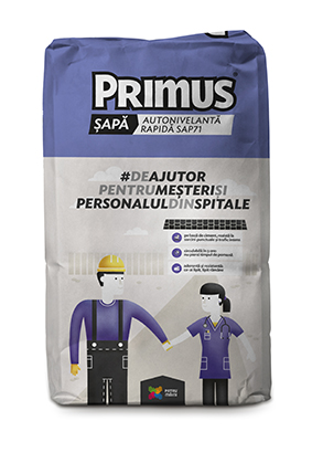
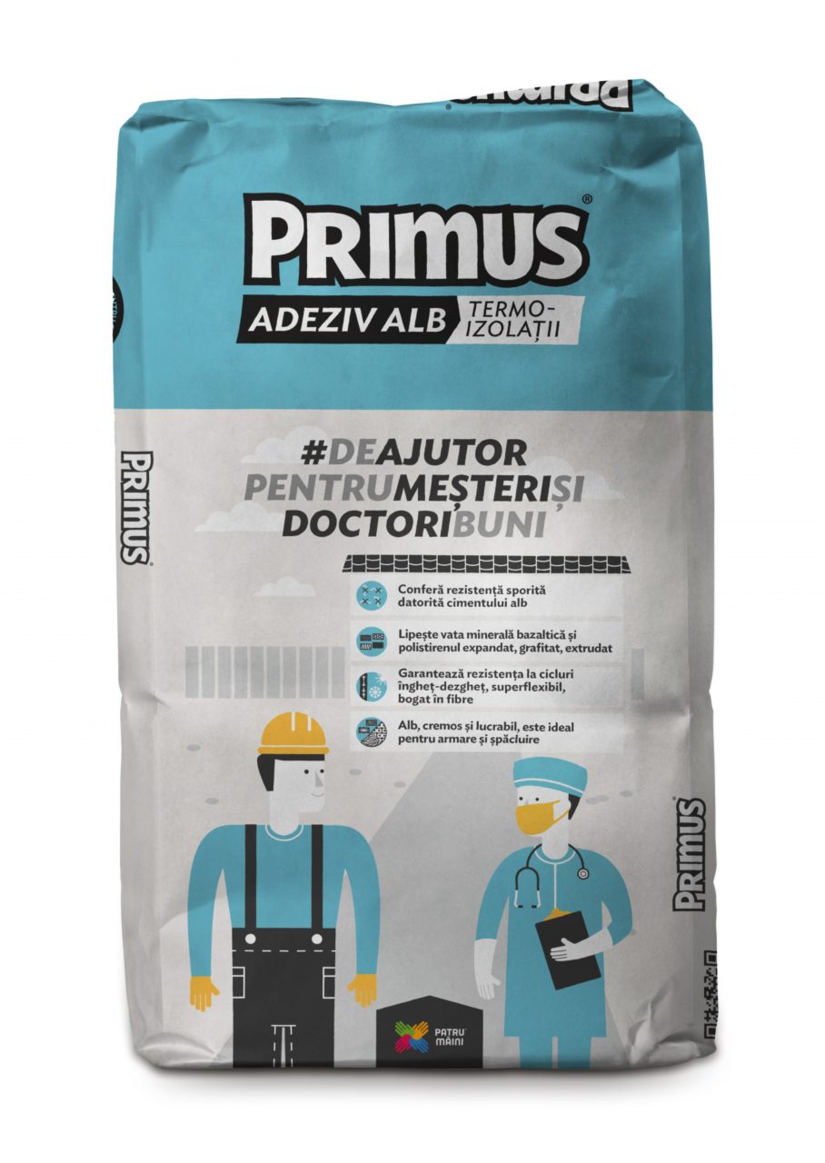
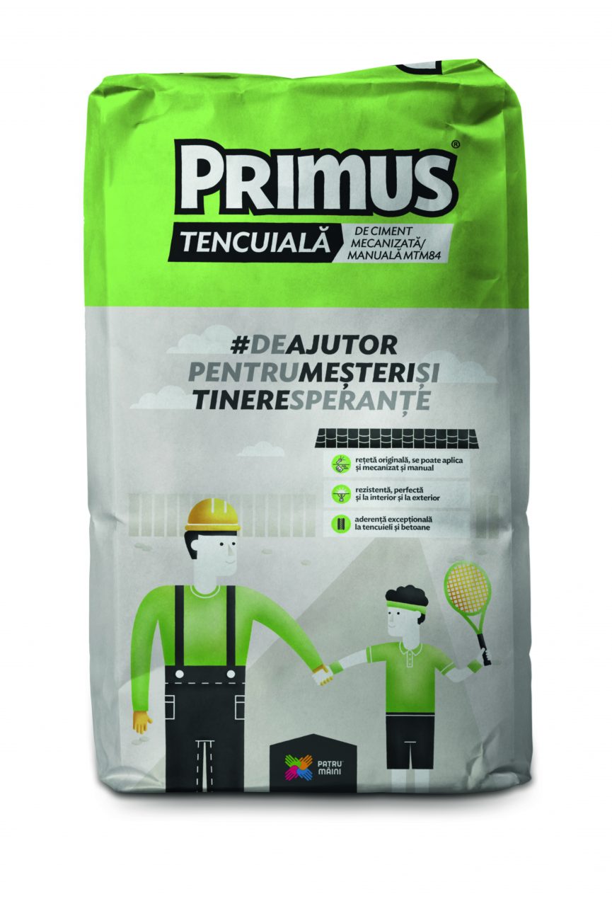
Primus – the range targeting workmen, products that are not visible in the end product (the finished building)
![]()
![]()
Range tagline: Helpful for honest workmen
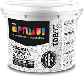
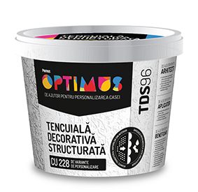
Optimus – the range targeting architects and end-beneficiaries,as it has products visible in the final construction
![]()
![]()
PACKAGING
Products needed to be in-line with the new brand and to accurately reflect the brand mission and vision, so we needed to develop a packaging system to do that. Moreover, since these packs are quite big (20-25kg) and since the brand does not use traditional advertising media too often in order to direct such funds to social renovations, our packaging insight was that we can use the sacks as a communication medium.
This packaging project was one of my soul babies, mostly because I am fascinated by packaging devices (see my collection on Pinterest) and this was my first serious packaging work (as brand grower and account manager).

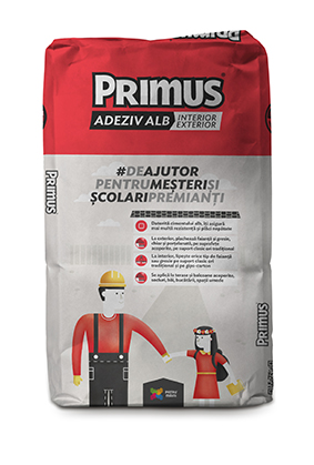
The illustrations depict vignettes of the help: the craftsman (the product buyer/ decision maker) together with a beneficiary of the renovation: a child, a teacher or a doctor in a hospital.
In the end, a good year after we kicked off the package rebranding, what I was secretly hoping for actually happened: people in the company (the internal target) started naming the products by referring to the characters on them.

Before the rebranding, the packaging was utterly technical and generic, and it did not fit with the human-centered approach the new brand had. This is how they used to look:
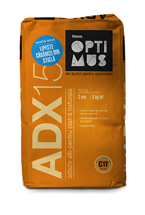

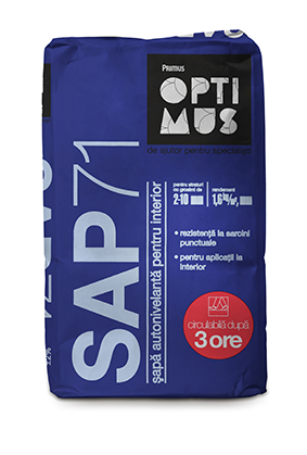
For the Optimus Range the packaging strategy was to create a more premium pack, to inspire architects and to stand-out among the category’s ultra-cluttered designs. It depicts the medium on which the product is to be applied – such as marble, natural rock, etc.

We worked on all kinds of materials for Patru Maini, from give-aways for craftsmen to business cards and other templates to in-store promotions and brand materials.
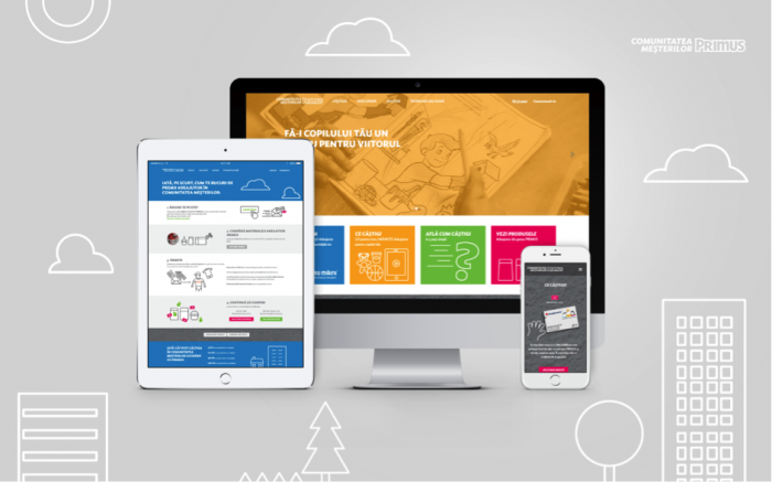
WEBSITE
Their website also needed to be in-line with the new brand – both from a design standpoint but also from a user experience POV. It needed a human, warm tone of voice. The competitors have quite a generic communication, as I was mentioning before: product-centric, focused on the technical product attributes.
So, since the new brand – Patru Maini – is about help, about collaboration, about the power of the positive example, the web design needed to reflect that.
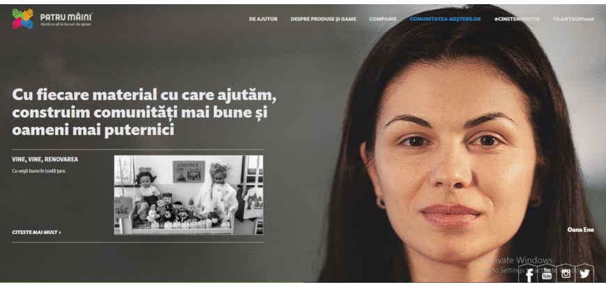
We used full width images – a mix between photographes of the members, the products, and brand imagery. In the first screen the user is welcomed by the entire client team – because they have a very personal approach in everything they do.
See some more work from this client here.