The Power of NO – Adobe | D&AD New Blood
Posted by Raluca Turcanasu on / 0 Comments
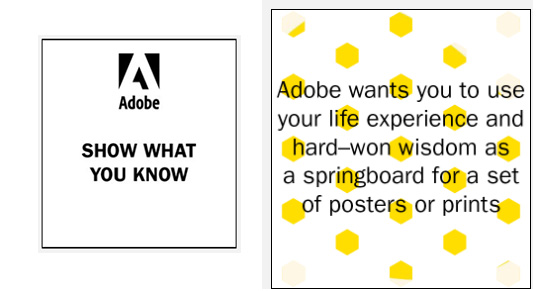
This year I was super excited to participate in D&AD’s New Blood Awards, on the Adobe brief.
It was an amazing learning experience and I highly recommend it to all students and recent graduates. And even to teachers (hinting here at my dear Mrs Madalina Moraru) – the real briefs are an amazing practice material.
I worked closely with my friend Vlad Rasuceanu from 8i Studio: I acted as strategist and copywriter and he helped me with the design and motion.
Why did I choose the Adobe brief?
We both had plentiful of life and work-related learnings (mishappenings, cunning encounters, being naive) in the past year and it did fit us like a glove. I was enlightened to most of them after breaking my leg, which I still see more like a blessing than like a curse.
So we sat down one night and listed our learnings:
- Say NO to bad deals, so that you stand by your principles and have time for great deals!
- If you give shit to people, countless shit will come your way!
- Money driven projects don’t make good projects.
- Start (a project) with all resources in the bag. Don’t go on a mission without all tools. (Or, „Don’t go hunting with a deaf dog”)
- Simplification. It’s about subtracting information, not adding. Delete the unncessary. Cut the noise.
- Detachment & mindfulness. Clean & lean interior.
- Bad experiences are still good experiences. You just need to see the good in them. Celebrate fails!
- Don’t save any energy for the way back.
- Unconditional love is about yourself. The love and trust you have in yourself that impregrantes your behaviour, actions and thoughts at all times.
- Nobody is going to pick you. Pick yourself!
- Equality – the ball must bounce the same for everyone.
- Don’t get into too many projects! You’ll end up not delivering properly! Learn to time-estimate your work.
But they were too many and I needed to conceptualize everything in a single-minded idea that would bring consistency with the 3 graphic design executions and work as a red line of the campaign.
So, in order to get our minds off executional creative ideas and off the life experiences, I decided to do a quick exercise that would bring us back to the creative brief and also make sure we have the same understanding of it. It’s one of the D&AD’s tips & tricks and it will help you reduce a lengthy brief to its essential – the One Liner or How to break down a brief. Nick Eagleton from The Partners also talked about this at #DANDAD17.
For us, the one liner became
FUN ADVICE.
So, we needed to talk about our advice in a fun (and unexpected way).
What next?
I did my background check before hand and segmented the target our campaign would address (20+ something creatives and makers) and also went through Adobe’s communication beforehand.
Why?
I felt that if Adobe (the brand, not the partner company) was to sign off this piece of communication it should be in line with the brand communication, it should be ownable and appropriate to the brand personality and tone of voice.
So we both went on to analyze the mini-research I pulled:
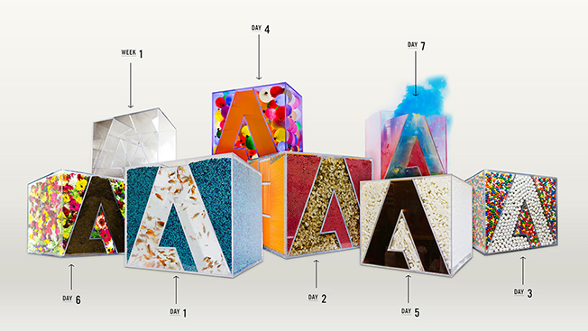
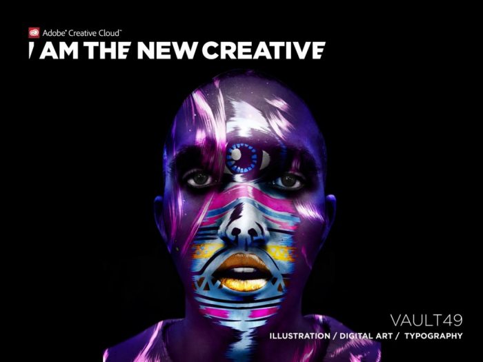
Looking at the creative work Adobe had done before, we realized one common trait: it used, it celebrated designers’ work from across the globe and it could be endlessly executed in different visuals, under the same graphic concept. Check them out:
Next…
After reviewing and debating this work and our long list of life learnings I saw the concept that governed them all: „NO!”. The power of saying no to luke-warm projects, rekindled ideas, weak business proposals, faulty project flows.
Insight:
In a world where everyone and everything screams POSITIVITY, making it ultimately fake, it is a blessing to discover the power of selection, of refusal, how empowering a „no-bullshit” approach can be. How many good things come to those who first say no, only to wait for the right project, moment, opportunity, team, job.
So there it was, our campaign concept, together with the replicability criterion – that anyone could design his own powerful NO manifesto, under one unitary graphic concept.
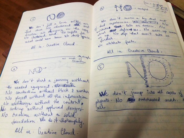
Some of my very first sketches, while copywriting (to be honest, I cannot write a text without envisioning a little the layout in which it will live):
Then, I presented it to Vlad and he immediately liked it so we moved on to Adobe Illustrator:
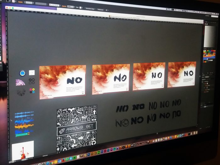
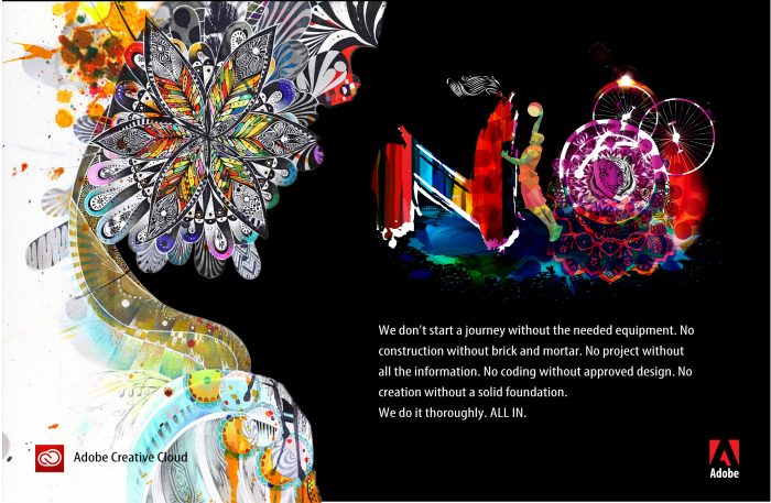
We played with various elements for a while and the first poster was ready… in an initial 3 variations:
The other two came out even prettier:
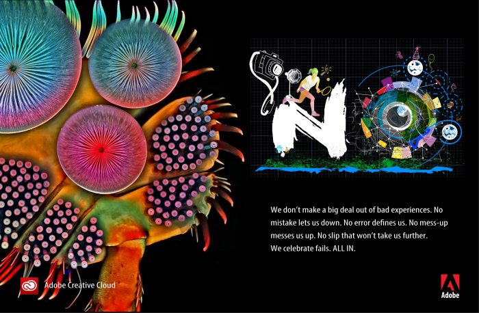
And, even if it was optional, we decided to work some motion graphics, a 30 sec video that would further explore the concept and empower creatives and makers to only take up the worthy things that come their way:


